I did a bit of photoshopping trying to feel some colors from the SH2RE trailer. Hopefully the image embedding isn't too big for this forum.
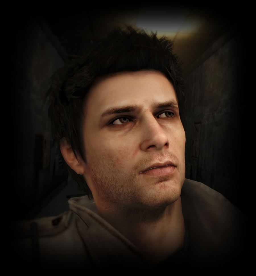
What I noticed when referencing the original PS2 version is that the lighting was fairly simple (I have no deep knowledge of PS2 era lighting engines - I remember that the moving shadows from the flashlight when Laura kicks the key was a big deal technical wise) and often neutral in color. The color palette is achieved mainly by environmental material choices and background textures. Sometimes the light and fog effect is colored (e.g. when Maria opens up the door to Heaven's night - if I remember correctly this was a timed sunset event that took like 6 minutes to transition fully).
The SH2Remake seems to lean heavily towards modern common lighting schemes - strong warm light contrasted with cool shadow, or the very blue foggy scheme from the top most image. Now these are very functional and well used lighting techniques based on colors complementing each other and having that sweet sweet warm versus cool contrast. The flip side for such a popular cinematography lighting is that sometimes films and video games tend to homogenize toward very similar color palettes. I liked the washed out, bleak, sometimes sickly green and blue (that reminds me of water damage and damp moldy basement) look of PS2 SH2, but I am also very certain that they used custom lighting for the trailer to make it look visually appealing for big audience and easy-to-digest and doesn't entirely represent the color palette or lighting of the final product.
BTW the film grain adds a LOT - I really hope they include the setting for the game.
You can see the original large 4k image here
I'll keep adding the observations of visual comparisons here and probably take a bit more focused take on some certain scene to try to photoshop it towards something I liked from the original version. This isn't really PS2 vs SH2Re debate, more of an comparison and observation. I keep rambling more about color and cinematography after I get some sleep.
Visual comparison and observations
Moderator: Moderators
- silentevil1989
- Just Passing Through
- Posts: 31
- Joined: 23 Sep 2013
- Gender: Male
Re: Visual comparison and observations
Great job editing the shots, I really liked your changes to the colour palette and that's what I would like to see in the game. The film grain and proper colour filter are indeed essential to nail that dirty, damp, sickly look of the original game, they add so much to the atmosphere.
These important details are what worry me about the remake, as I don't think that Bloober Team has the sensitivity to capture the nuances that you perfectly did on your analysis(es). I'm afraid the game will be very "pasteurized" for modern audiences, but here's hoping I'm wrong.
- otto2302
- Just Passing Through
- Posts: 95
- Joined: 31 May 2010
- Gender: Male
- Location: Blue Creek Apt.
- Contact:
Re: Visual comparison and observations
Thanks! I'm quite sure that they have setup lighting specifically for the trailer to get, well, a good looking horror game trailer and it probably doesn't represent the finished product. If I would be developing a remake of any classic game while designing lighting and color grading I'd at least have some reference art boards in hand from the original game.silentevil1989 wrote: ↑01 Sep 2023 Great job editing the shots, I really liked your changes to the colour palette and that's what I would like to see in the game. The film grain and proper colour filter are indeed essential to nail that dirty, damp, sickly look of the original game, they add so much to the atmosphere.
These important details are what worry me about the remake, as I don't think that Bloober Team has the sensitivity to capture the nuances that you perfectly did on your analysis(es). I'm afraid the game will be very "pasteurized" for modern audiences, but here's hoping I'm wrong.
Re: Visual comparison and observations
Yes! I am liking your edits. The grain and lighting tweaks really add a lot!